Introduction
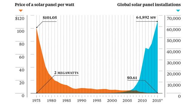
Over the last decade, U.S. residential and commercial solar panel installations have grown dramatically. This is in large part due significant reductions in cost, but also because of growing concerns regarding climate change. In the last ten years, solar installation costs have fallen by over 70% and they continue to improve.
The full extent of this growth, however, is not well understood as the data for residential and commercial solar installations is typically reported only at the level of the state. Having a more granular dataset would benefit a number of parties, including utilities, policy makers, and solar developers. Utilities, in particular, will face many challenges integrating such a high amount of distributed generation and therefore will benefit greatly from understanding the magnitude and distribution of these resources.
The goal of this project is to identify solar panel arrays in high resolution satellite imagery using machine learning techniques. Specifically, I will divide images into segments by grouping similar pixels together, calculate features for each image segment, and train a classifier to differentiate solar panel regions from non-solar panel regions.
Dataset
In this analysis, I will utilize a dataset created by the Energy Data Analytics Lab at Duke University. The dataset contains geospatial data and border vertices for over 19,000 solar panels, located in the California cities of Fresno, Stockton, Oxnard, and Modesto. The full dataset of images and annotations can be found here.
The satellite images are part of the USGS collection of High Resolution Orthoimagery (HRO). The majority of the raw images are 5000x5000 pixels, at a resolution of 0.3m/pixel. Although the USGS High Resolution database does not encompass the entire U.S., it does cover many urban areas in the country and continues to grow as the agency acquires new data.
Below is a summary of the solar panel annotations for the entire dataset.
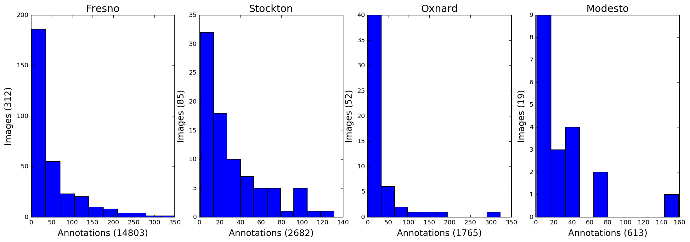
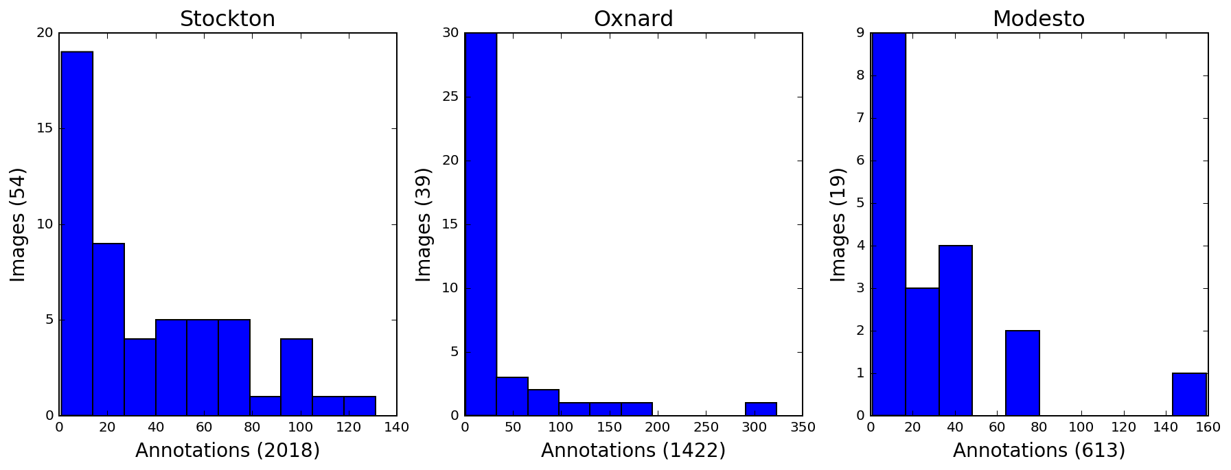
Due to size constraints, a subset of the larger dataset was used for this analysis. This subset contains all cities except Fresno.
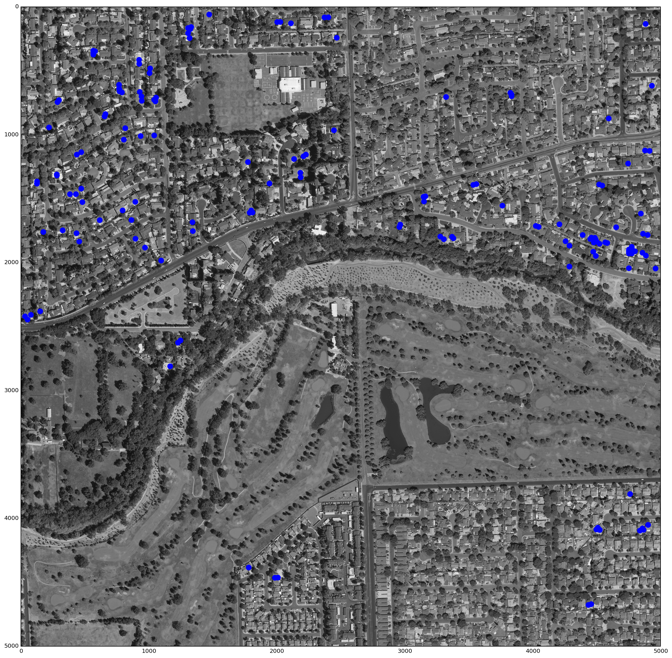
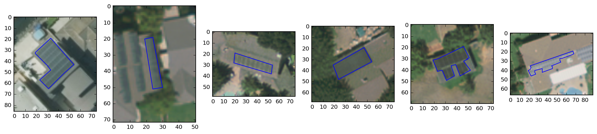
Here you can see one of the satellite images from the dataset, with solar panels plotted in blue.
To show how this looks on a more granular basis, I've zoomed in on five panels and plotted outlines using the polygon vertices provided in the dataset.
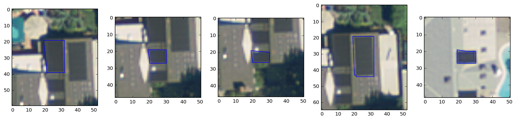
Image Segmentation
Image segmentation consists of grouping pixels together based on likeness (e.g. color value, proximity). Relevant information can then be extracted and aggregated across each image segment, instead of from the individual pixels themselves. This approach produces a more meaningful model of the image data and simplifies the classification process. Additionally, segment-based classification can often achieve better accuracy than a pixel-based method.
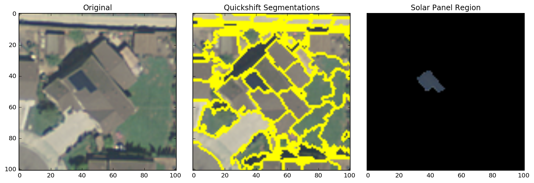
Below is an example segmentation applied to a satellite image containing a solar panel. As you can see, the image has been partitioned into contiguous regions with similar pixel values.
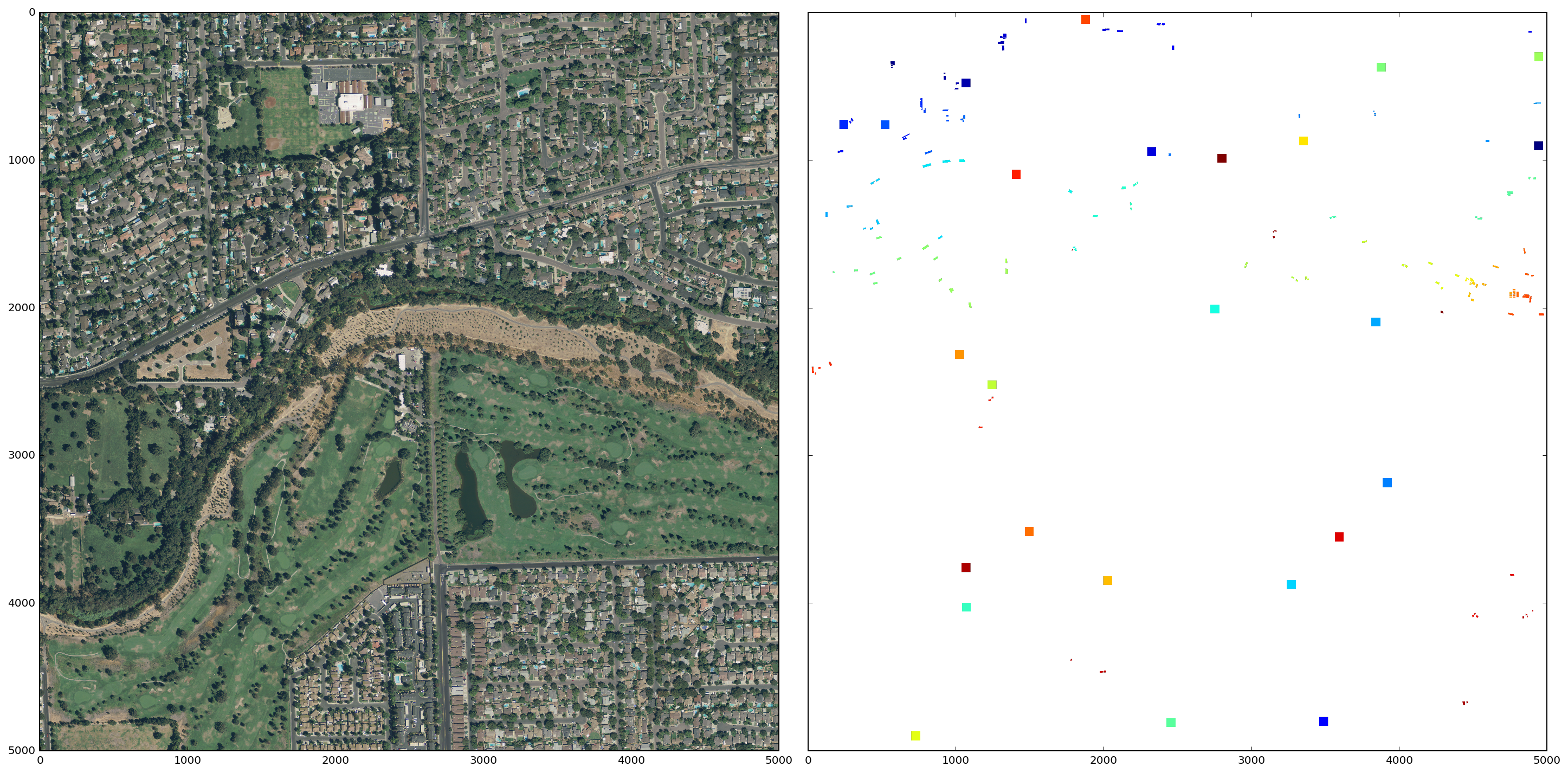
The satellite image above is only 100x100 pixels, however, so I will modify the segmentation process for the larger 5000x5000 pixel images. In particular, I will use the annotations data to "segment" the solar panel arrays. In the larger images, solar panels make up a tiny fraction of the total area (< 1.0%). Therefore, to generate the segments that do not contain solar panels, I will sample sections of the image and run the segmentation algorithm on these sections.
The panel segments and the non-panel sections (colored squares) for a sample image are shown below.
Feature Extraction
Feature extraction is a key component of image analysis and object detection. I aim to classify segments or superpixels and will therefore calculate features based on these regions of pixels, rather than the pixels themselves. Once a feature set is established, I will then be able to train a classifier to identify regions that are best representative of solar panels.
In this analysis, features will mostly consist of summary statistics for each color channel (e.g. mean, min, max, variance) but will also include other descriptive values such as area and perimeter.
I first define a function to extract spatial features such as area and perimeter. Additionally, I use area and perimeter to calculate a new feature 'circleness' which measures how circular a region is. A value of 1 indicates a perfect circle, whereas a square is ~.80.
def segment_features_shape(segments):

    # For each region/segment, create regionprops object and extract features
    region_props_all = measure.regionprops(segments)
    region_features = {}

    for i, region in enumerate(region_props_all):
        shape_features = {}

        shape_features['perimeter'] = region.perimeter
        shape_features['area'] = region.area
        shape_features['circleness'] = (4*np.pi*region.area) / (max(region.perimeter,1)**2)
        shape_features['centroid'] = region.centroid
        shape_features['coords'] = region.coords

        region_features[i] = shape_features

    shape_df = pd.DataFrame(region_features)

    return shape_df
Next, I define a function to extract the color related features. This function iterates through the red, green, and blue channels of the image region and calculates the relevant values.
def segment_features_color(img, segments):

    # Generate unique labels list
    segment_labels = np.unique(segments[segments > 0])

    # For each segment and channel, calculate summary stats
    channels = ['r','g','b']
    region_features = {}

    for label in segment_labels:
        region = img[segments == label]
        color_features = {}

        for i, channel in enumerate(channels):
            values = scipy.stats.describe(region[:,i])
            color_features[channel + '_min'] = values.minmax[0]
            color_features[channel + '_max'] = values.minmax[1]
            color_features[channel + '_mean'] = values.mean
            color_features[channel + '_variance'] = values.variance

        region_features[label] = color_features

    color_df = pd.DataFrame(region_features)

    return color_df
Classification
Logistic Regression
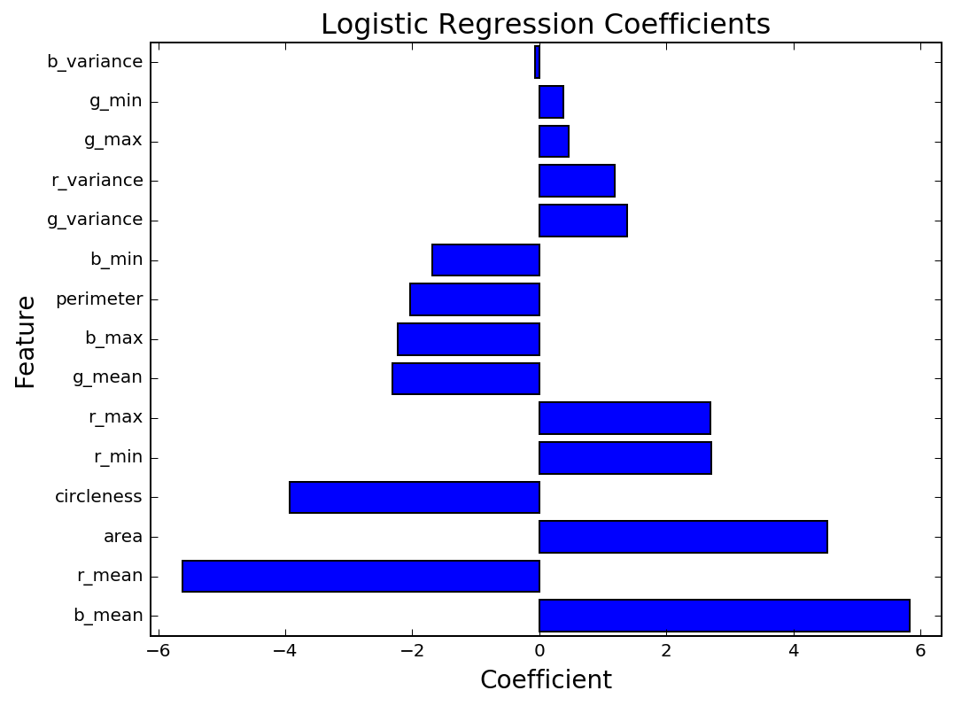
I've chosen to use Logistic Regression due to its simplicity and interpretability. The initial results are encouraging, with an accuracy of 96% on the testing data, compared to a baseline accuracy of 91%. As seen in the graph of coefficient values below, the features that are most meaningful are the mean color values, area, and circleness.
Random Forest
Decision Tree models are comprised of a series of nodes, or decisions, where an element of the data is tested e.g. x > 5. These tests are derived by evaluating how effective they are at dividing the data into homogenous groups. A Random Forest is simply a collection of Decision Tree models, where each Decision Tree is fit on a random sample of the data. Random Forests are very powerful and are adept at learning complicated, non-linear relationships.
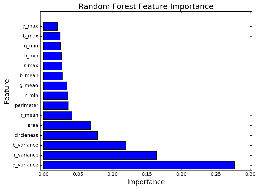
By using many Decision Trees on multiple versions of the dataset, overfitting can be avoided. This reduces model variance significantly with only a small increase in bias. This is a key advantage of using ensemble methods. For this reason, I've chosen to use a Random Forest Classifier. The Random Forest outperforms the Logistic Regression, with an accuracy of 98% compared to a baseline accuracy of 91%. As with the Logistic Regression, the Random Forest placed high importance on the area and circleness features. However, the Random Forest feature importances show that the most important features were the color variances.
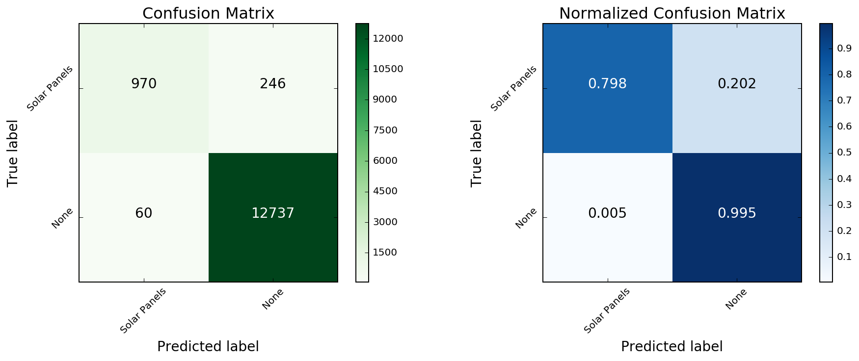
To evaluate the performance of this classifier, I will compare the model predictions against the true values. When the dataset is strongly imbalanced, as is the case here, this can be a much more intuitive way to analyze the results. To visualize this I will use a Confusion Matrix, which shows the proportion of correct/incorrect model predictions.
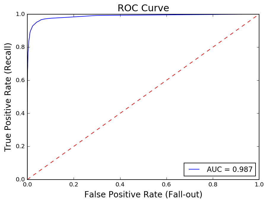
The Receiver Operating Characteristic curve measures the True Positive Rate or Recall (TP / TP + FN) against the False Positive Rate (FP / FP + TN). There is a tradeoff between and the two and plotting the ROC is a helpful way to analyze the effectiveness of a classifier.
In this analysis, the True Positive Rate measures how many solar panels are being correctly classified, out of the total number of solar panels in the image. As this ratio increases, however, the number of non panel regions that are being misclassified as solar panels also increases. The AUC, or Area Under the Curve, is a common way to quantify this tradeoff. An AUC of 1 reflects perfect classification.
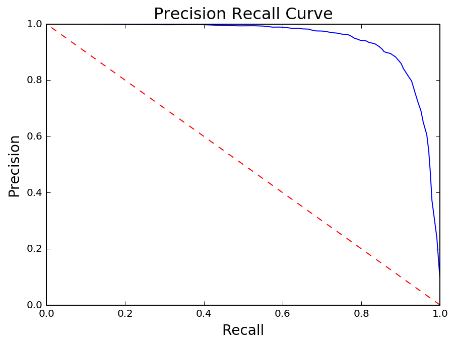
The Precision Recall curve is closely related to the ROC curve in that both reflect tradeoffs. Instead of the False Positive Rate, however, Recall is compared to Precision which measures the number of true positives out of total positive predictions (TP / TP + FP).
Misclassified
Around 20% of the solar panels are being misclassified as 'not a solar panel' using the current model. I will examine the false negatives with the lowest predicted probabilities in order to better understand where the model is failing the worst.
Conclusion and Next Steps
The results from this analysis demonstrate that it is possible to successfully use satellite imagery to detect objects of interest. In this case, the pixel characteristics of solar panels uniquely identify them within a large background. Going forward, there are a number of areas for further improvement.
Problematic Panels
It's clear that there are two types of solar panels that have proven difficult to detect. Panels that appear very light in color, and those that show significant grid lines. In the first instance, the panels tend to blend in with the roof of the building and are therefore difficult to distinguish. In the second case, the color values and variance are skewed relative to the rest of the dataset.
Images in the Wild
The end goal for this project is to classify solar panels in images that have not been annotated. I have begun the process of generalizing this framework to images 'in the wild'. The key challenges will be as follows:
- Segmentation - Ensuring that the entirety of a solar panel is included in its own region. Will require fine tuning of segmentation algorithm parameters and potentially pre-segmentation image processing (filters, denoising, etc.).
- Modify Classifier - Bridging the gap between the data that the classifier trained on and what will be outputted from a new image. Specifically, solar panel annotations in the ground truth dataset do not necessarily match up with what a segmentation algorithm will extract for a solar panel region.